Boring work. Better data.
Stop making decisions with data you don't trust. We build Business Intelligence systems that replace doubt with confidence, using Power BI, Microsoft Fabric and Databricks.
// No sales pitch. No commitment. Just insights.
You don't want another dashboard.
You want to trust the numbers in it.
Reporting people actually trust.
See our dashboard service →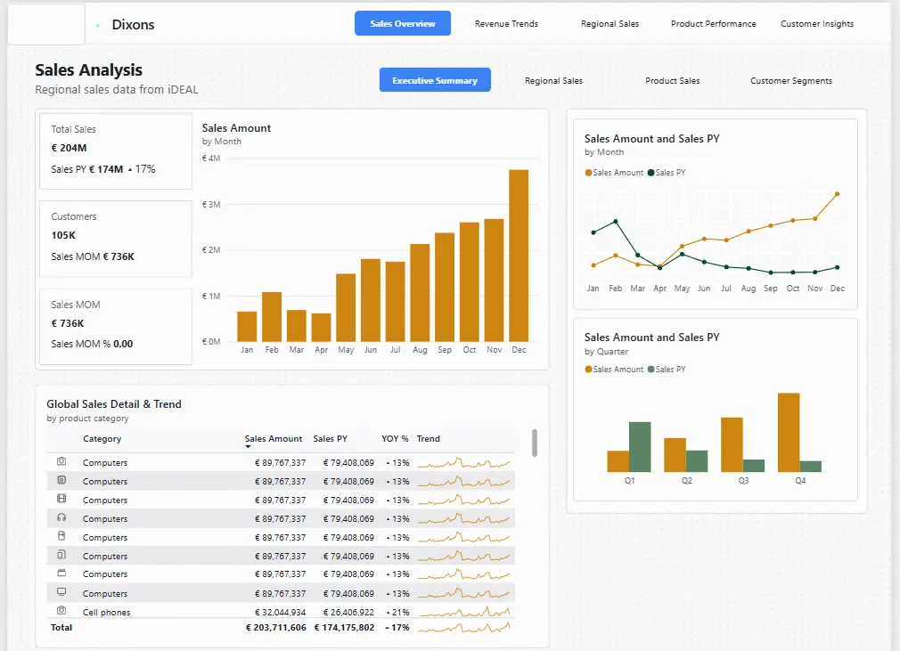
Dixons Sales Analysis
Regional sales breakdown tracking €204M in iDEAL transactions across product categories. Revenue by region, trend over time, and top-performing product lines all in one view.
- Power BI
- DAX Measures
- Bar Chart
- KPI Cards
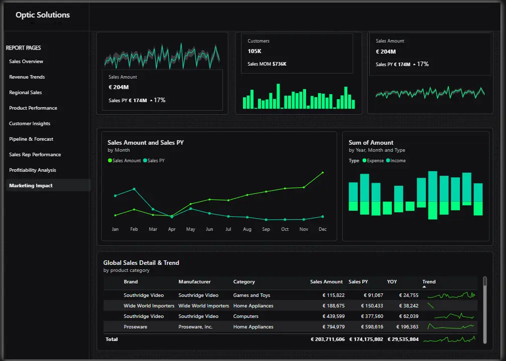
Optic Solutions Marketing Impact
Dark-theme dashboard tracking €204M in revenue across product categories and sales channels. Forecast vs actuals, category breakdowns, and marketing attribution built for executive review.
- Power BI
- Dark Theme
- Area Chart
- Time Intelligence
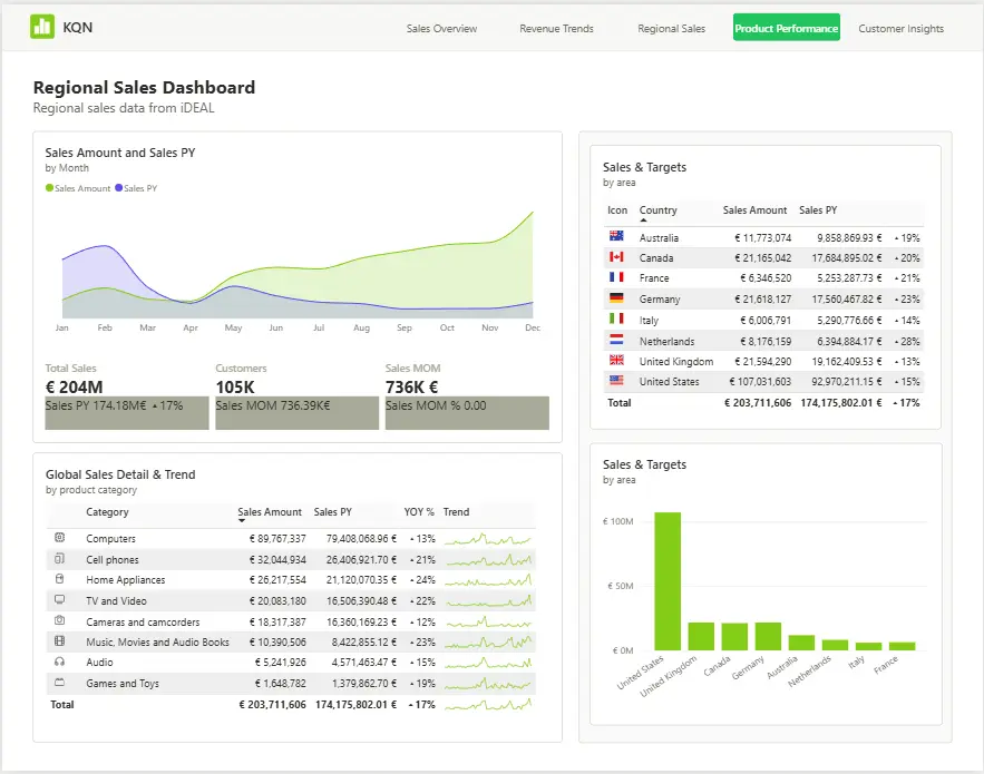
KQN Regional Sales Dashboard
International sales performance across 8 countries revenue vs target, category breakdown, and regional trends. Built for a team that needs to track progress across borders at a glance.
- Power BI
- Country Flags
- Area Chart
- Sales vs Target
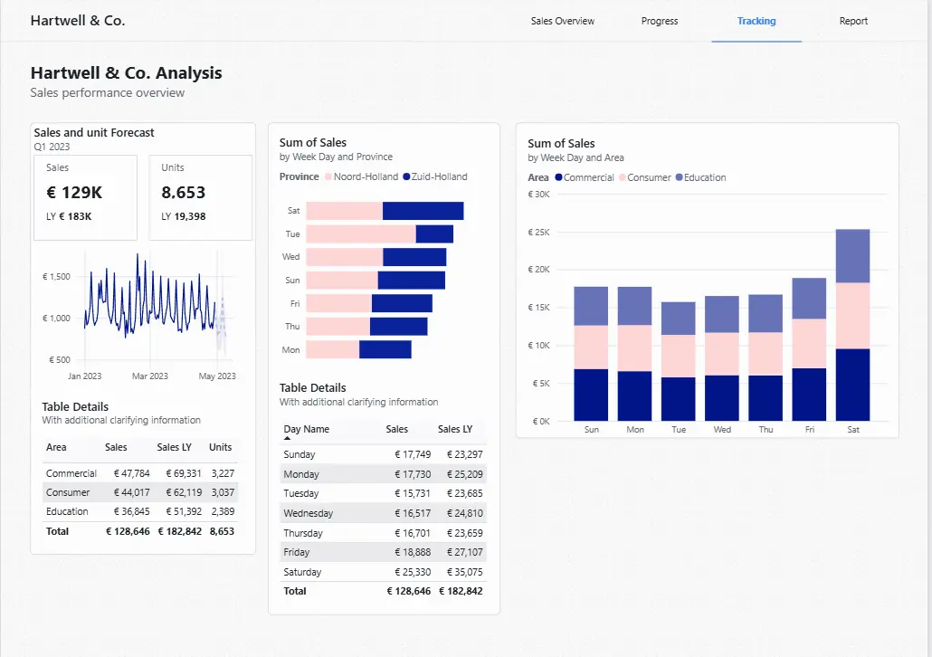
Hartwell & Co. Sales Tracking
Netherlands sales breakdown by province Noord-Holland, Zuid-Holland, and beyond. Revenue by day of week, sales rep performance, and weekly trend analysis in one clean view.
- Power BI
- Netherlands Data
- Bar Chart
- Time Analysis
The boring
technical work
that matters.
Reliable pipelines. Consistent models.
Data you can trust.
Chaos in. Clarity out.
Two departments arguing over whose number is right. A decision made on a guess instead of a number anyone trusts. That stops here.
From raw data to
trusted decisions.
Click each layer to see what happens inside it.
→ Read the full breakdown of our data warehouse, ETL/ELT, and modelling service.
What our clients say.
They brought real structure to how we track and report on our projects. We now have clear visibility across jobs that we never had before.
FAQ
BoringBI is built for businesses that need reporting people actually trust. It works well for:
- SME owners without an in-house data team
- Finance and operations leads drowning in spreadsheets
- Companies mid-way through modernising legacy reporting frameworks, or at the start of a migration project
- Logistics and warehousing teams running on SAP
- Founders who've outgrown gut-feel decisions
- Public sector teams and non-profits needing Business Intelligence consultancy support
If you're looking for reporting without the jargon or the twelve-tab spreadsheet, BoringBI is designed for you.
Power BI is the tool, not the fix. Most reporting problems aren't really about the software, they're about nobody asking the right questions before the dashboard got built. We start with conversation, not a data model.
Most agencies spread across web, apps, infrastructure, and BI as one line among many. BoringBI is specific and interlinked instead: Power BI, data engineering, and the Microsoft and Databricks stack, treated as one connected discipline. Migration is another arm of the business, not the whole of it.
Then we tell you that. The discovery session is free with no obligation. If your reporting is already solid, you'll leave knowing that, not with a pitch you didn't ask for.
Every project is different. Building a dashboard isn't the same as delivering a data warehouse or migrating a legacy reporting platform. Rather than offering fixed packages, we provide a clear scope and transparent pricing before any work begins.
What will your
data reveal?
Free discovery session no sales pitch, just a clear-headed look at what your data could do.
// based in the Netherlands, working with clients globally